Golf Club Website Design: Key Elements for Members
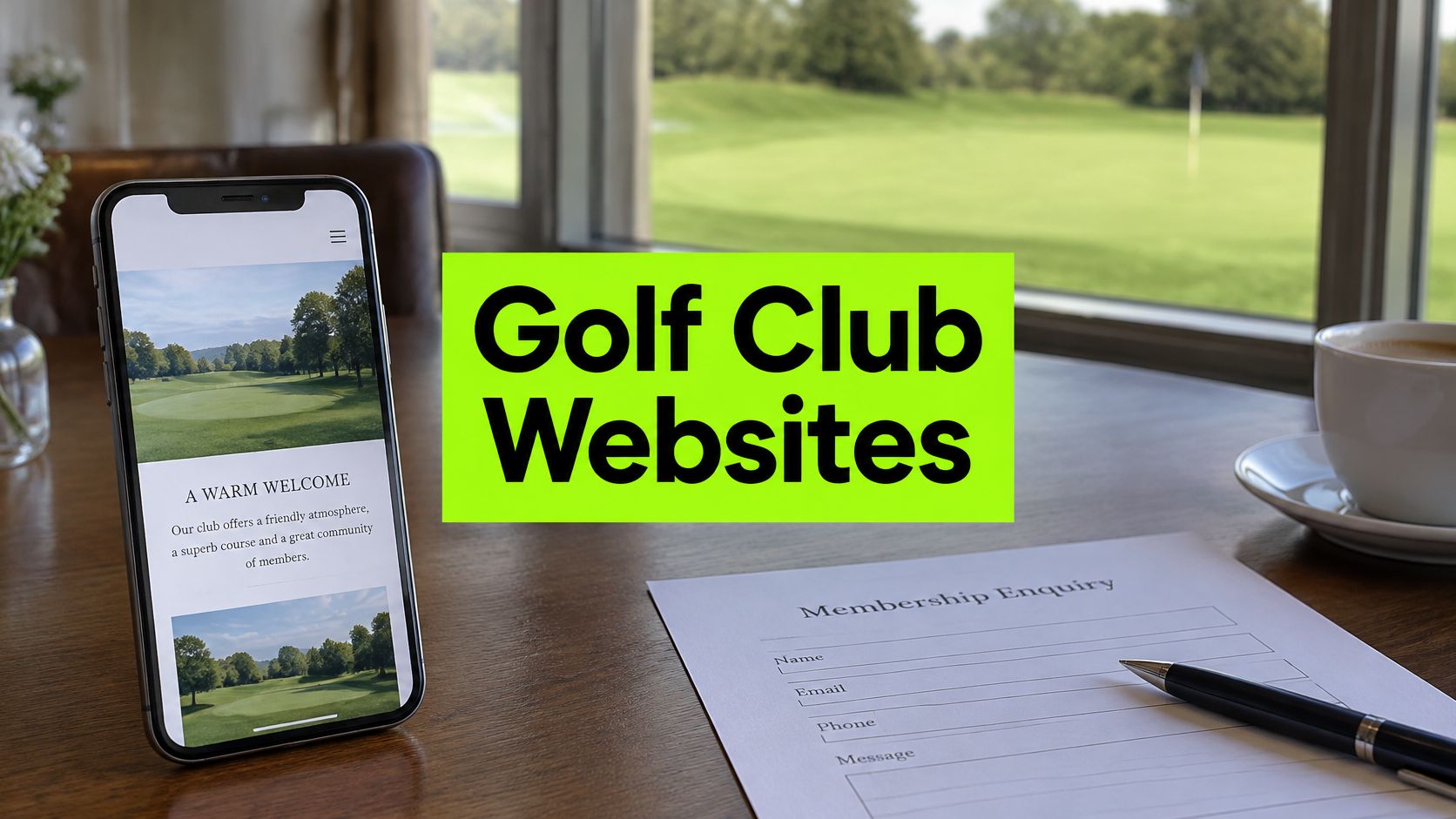
You're reviewing the club website before the next membership campaign. The course photographs still look good, but on your phone the membership fee takes some finding, the visitor button opens a login screen, and nobody's quite sure which pages generate bookings.
A redesign might help. But before approving one, check whether golfers can complete the important tasks unaided. At GolfRep, our starting point for golf club website design is the route from a golfer's first question to a useful outcome, whether that's a tee time, membership visit or society enquiry. Fix the weakest part of that route before replacing everything around it.
Essential Elements of a Golf Club Website
Core elements of a golf club website
| Element | Job it must do | Pass test |
|---|---|---|
| Mobile layout | Show the offer and the next action on a phone | Membership and booking buttons visible without scrolling |
| Page speed | Let key content and actions load quickly | Core pages usable before decorative media finishes loading |
| Accessibility | Let every golfer complete the journey | Prices, booking and enquiry completable by keyboard and screen reader |
| Membership information | Answer what membership costs and includes | Each golfer type finds a clear answer on one page |
| Booking path | Turn interest into a tee time | Booking reached in no more than one screen from any campaign page |
| Enquiry form | Capture a request in under a minute | Form works on a phone with few required fields |
| Tracking | Show which pages produce enquiries and bookings | Each enquiry tagged to its source page and reviewed monthly |
These are audit targets, not reasons to fill the homepage with competing buttons. Each page needs a clear job, with the most relevant action given priority.
Google Search was used by 82% of UK online adults in May 2025, according to Ofcom's Communications Market Report 2026. Design for someone arriving directly on a service page, not just someone entering through the homepage.
Membership, society golf, lessons, weddings, open competitions and pay-and-play need clearly labelled destinations. Each should state the location, offer, eligibility, price or enquiry route, and next step. A society organiser needs package details and catering options, not a general account of the club's heritage.
Apply the one-screen test
Within the first screen, can the visitor understand what's offered, what it costs or requires, and what to do next? Where a full price needs explanation, show the starting commitment or a clear route to the relevant fee.
Read the table as a practical inspection order. Mobile layout determines whether the offer is visible; speed determines whether it becomes usable. Accessibility checks whether the visitor can operate it, while membership information answers whether the offer suits them.
The booking path and enquiry form then let the golfer act. Tracking tells the manager whether those actions happen, rather than reporting visits.
Practical rule: A website passes when a golfer can finish the task, not when the committee agrees that the page looks attractive.
These elements form a chain. A fast, readable page without a usable next step still leaves the golfer stranded. Start the inspection on a phone.
Mobile Layout and Page Speed on Small Screens
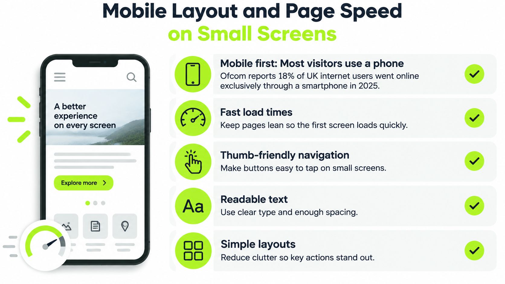
For some golfers, there's no desktop visit later. Ofcom's account of UK online habits reports that 18% of UK internet users went online exclusively through a smartphone in 2025.
Open a core page on your phone. Aim to show the relevant membership fee or visitor rate, primary action, location, essential opening information and contact route without opening a menu. Use compact text rather than squeezing everything into tiny type.
Make the page comfortable to use
Touch controls need space. Test buttons with a thumb, including the close control on cookie notices. Keep forms in a single column, enable autofill and use appropriate email and telephone keyboard types.
Readable text beats downloadable paperwork. Publish membership fees, booking terms and essential scorecard information as web text. A printable scorecard can remain available, but it shouldn't be the only way to understand the course.
Navigation needs priorities. Existing members should have a recognisable route to competitions and booking without forcing prospective members through the same login. A mobile menu shouldn't require knowledge of the club's internal committee structure.
Make useful content load first
Ask your developer to compress course photography into WebP or AVIF, lazy-load galleries below the fold and remove autoplay hero video. Defer non-essential chat and analytics scripts, while checking that consent controls and measurement still work correctly.
Photography matters, particularly when selling a visit to an unfamiliar course. The trade-off is between showing the course well and making someone wait before they can use the page. Networking2000's resource lets managers explore faster mobile website design when discussing those implementation choices.
Run these checks this week:
- Use mobile data: Test the homepage and membership page on a mid-range phone, away from office Wi-Fi.
- Watch the action: Time when the booking button becomes tappable, not just when a photograph appears.
- Try your thumb: Check menus, buttons and dismiss controls without zooming.
- Read the essentials: Find fees and terms without downloading a document.
- Interrupt the loading: Check whether the offer remains understandable while decorative media is still loading.
Record the device and connection used so your developer can repeat the test.
Accessibility Checks That Protect Bookings
Accessibility is a practical standard for completing a booking, not a badge for the homepage. A golfer who can read the visitor rate but can't select a tee time still can't use the service.
The UK Government's introduction to accessible services uses WCAG 2.2 AA as the minimum benchmark for government digital services. Private clubs aren't automatically subject to the same public-sector requirements, but the government's accessibility requirements guidance explains that service providers have reasonable-adjustment duties under the Equality Act 2010.
Inspect the controls golfers actually use
Check tee-time calendars and time pickers with a keyboard. Can you move between dates, select a time and see which control has focus? Test cookie banners too, including whether you can leave them without becoming trapped.
Pricing tables need sufficient contrast. Form errors should explain the problem in words, not just turn a border red. Prices or opening times embedded in photographs need an accessible text equivalent, while important spoken information in flyover videos needs captions.
Third-party booking widgets require the same scrutiny. Although your team may not control their code, you can document failures, raise them with the supplier and check the proposed fix.
Treat an inaccessible booking control as a conversion fault, not simply a reason to display the clubhouse telephone number.
Run a practical user test
Ask a golfer with low vision, someone using only a keyboard and an older member to find the visitor rate, book a visit and request assistance without phoning. Let them attempt the tasks without coaching; record the exact point where each person stops.
Use the results to rank fixes by how many journeys they unblock:
- Remove complete barriers first: Repair inaccessible calendars, submission buttons and keyboard traps.
- Clarify essential information: Fix unreadable prices, missing field labels and unclear errors.
- Improve supporting content: Add useful image descriptions, captions and accessible document alternatives.
An automated checker can identify some faults. It can't establish whether a golfer understands the booking conditions or knows that their request succeeded.
Membership Pages for Each Type of Golfer
Golfer types, their first question and the page content they need
| Golfer type | Question they arrive with | Content the page must hold |
|---|---|---|
| Full member prospect | What do I get for the fee? | Fee, joining costs, playing rights and tee-time access |
| Occasional or nine-hole player | Can I join if I only play sometimes? | Nine-hole and flexible options, with any minimum play stated |
| Visitor new to the club | What happens on my first visit? | Booking steps, dress code, visitor fees and arrival guidance |
| Junior or family golfer | Is there a route for my children? | Junior rates, age bands and family membership categories |
| Lapsed or returning golfer | Can I rejoin, and on what terms? | Rejoining terms, any reinstatement fee and a direct contact route |
A generic membership page tends to describe the club rather than answer these questions. Give each audience a clearly labelled section or dedicated page, depending on how much explanation the offer needs.
Put the answer to the golfer's first question near the top, then provide the detail. A returning golfer shouldn't need to read junior coaching information before discovering whether they can rejoin.
Explain the product without club shorthand
Present nine-hole and occasional-play options as genuine choices where the club offers them. Don't hide them beneath language suggesting they're lesser forms of membership.
The GCMA's account of evolving golf participation reports that England's nine-hole World Handicap System scores increased by 28% in 2025, compared with 14% for eighteen-hole scores. That supports giving shorter formats proper consideration, but it doesn't prove that a flexible membership page will convert better at your club. Test that proposition against your own enquiries.
Explain terms such as playing category, handicap requirement and dress code beside their first use. State whether beginners can join, how they establish a handicap and whether an introductory visit includes meeting the professional.
Publish a usable fee explanation
Where the club is comfortable publishing a fee, show it alongside joining costs, payment options and playing rights. If pricing changes by age band or playing frequency, publish the relevant range and a clear route to an exact figure.
Our guide to golf club membership tiers provides further context for organising those choices. The website shouldn't imply access rights that the membership terms don't support.
For a quick audit, assign each golfer type in the table to a colleague. Ask whether they can find their answer within about a minute of reading.
Advertising decision: Give any intended audience without a clear answer a suitable membership section before commissioning advertising aimed at that group.
This isn't a requirement to invent new categories. It's a requirement to explain the options you sell.
Booking and Call-to-Action Paths That Convert
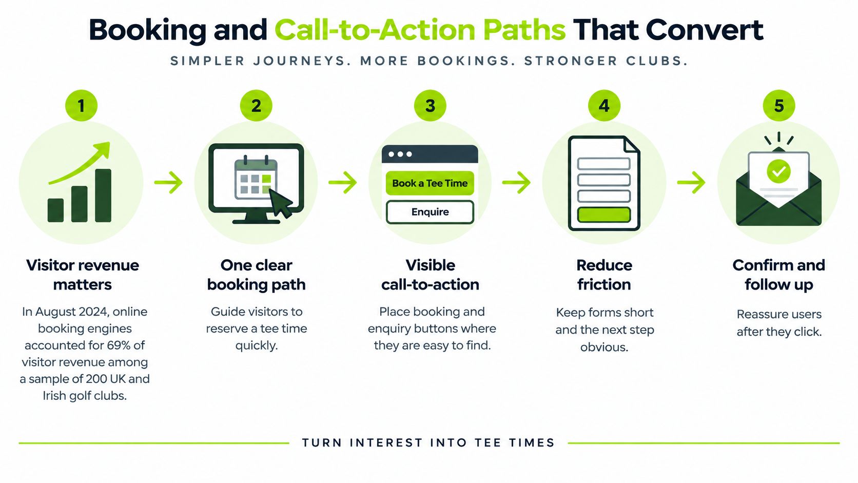
Online booking engines accounted for 69% of visitor revenue in August 2024 among a sample of 200 UK and Irish golf clubs, according to The Revenue Club figures reported by Golf Business News. That's a sample, not a target every club should adopt. Compare it with your own booking mix.
The visitor route should lead directly towards an available tee time, rather than through the member login. Make the intended journey explicit.
- Land on the offer. Show the visitor rate, what's included and live availability.
- Choose the round. Let the golfer select the date, time and number of players.
- Confirm and pay. Aim to allow a first booking without compulsory account creation, where the booking platform supports it.
- Receive useful confirmation. State arrival time, dress requirements, what to bring and where to check in.
Give each screen a clear priority
Use a primary button labelled with the action it triggers, such as Book a tee time, Arrange a visit or Explore membership. Secondary actions can remain available, but they shouldn't compete equally for attention.
Repeat the primary action at the foot of longer pages. Don't make someone scroll back through course photography after they've read the visitor conditions.
Membership visits need a different route from paid visitor rounds. Our guide to booking a visit online considers that distinct commitment.
Measure the hand-off and completion
Preserve campaign source information when the visitor moves into an external booking engine. Ask your developer to test cross-domain measurement, referral handling and completed-booking events rather than assuming a button click represents revenue.
Track these stages separately:
- Availability reached: The share of relevant visitors who view available tee times.
- Booking started: The share who begin selecting or reserving a slot.
- Booking completed: The share who reach a confirmed reservation.
Investigate the largest drop before changing the whole journey. Golfers leaving after seeing availability may be reacting to unsuitable times or prices, not poor button design. Check the actual screen and commercial offer before prescribing a technical fix.
Enquiry Forms and Handoff to Your CRM
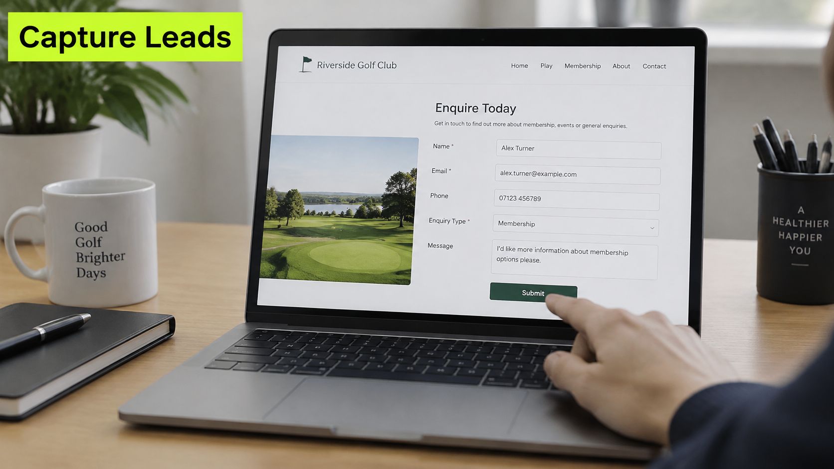
The enquiry form is where the page's promise becomes a request the club can act on. Ask enough to respond usefully, but don't turn an initial membership conversation into a full application.
For a first enquiry, start with five to seven fields as a design recommendation, not a fixed rule. These might include name, mobile, email, golfer type, preferred contact time and how they heard about the club. Mark required fields clearly, and leave postal addresses and detailed playing history until they're needed.
Separate the request from marketing permission
Keep marketing permission as a separate, unticked choice. Don't make agreement to promotional messages a condition of requesting membership information, and distinguish those messages from the reply needed to handle the enquiry.
Have the club's privacy adviser check the wording and processing arrangements against UK GDPR requirements. Explain how the club will use the information in plain language, with an accessible privacy notice beside the form.
The confirmation page is part of the service. State who will reply, when the golfer should expect contact and what happens next. Only promise a response time the team can reliably meet.
Give the request an owner
Send submissions into a central system rather than relying on a personal inbox. Capture the source page automatically, assign an owner and apply a first-response standard agreed with the commercial team.
The distinction matters when the professional handles lessons, the membership secretary handles joining and the events team handles societies. Each request needs a destination, with cover when the responsible person is away.
Our guide to golf club enquiry management explains the operational choices behind that hand-off.
Test the complete route:
- Submit on a phone: Include an error, correct it and check that the form retains useful information.
- Read the confirmation: Verify that it explains the next step rather than merely acknowledging submission.
- Find the record: Check the source page, owner and contact details in the club's system.
- Check other channels: Record phone and walk-in enquiries in the same place.
Review enquiries by source page and the share receiving a first response within the agreed time each month. Those measures distinguish a page that generates requests from a team process that handles them reliably.
Decide Which Website Fix to Make First
Measure before changing anything. Establish a four-week baseline covering visits by device, enquiry rates on key pages, booking starts and completions, and time to first response. Treat that as a practical review window, extending it where seasonal demand or low volumes make comparisons unreliable.
Symptoms, likely bottlenecks and the first fix to try
| Symptom | Likely bottleneck | First fix to try |
|---|---|---|
| Plenty of visits, few enquiries | Page content or clarity of the offer | Rewrite the membership page above the fold and add one primary call to action |
| Enquiries arrive but few join or visit | Follow-up after the enquiry | Check first response time and the joining or visit route |
| Strong mobile traffic, weak mobile enquiries | Mobile layout or form friction | Test the form on a phone and cut the number of required fields |
| Low visits from search | Page structure and search pages | Create a separate, clearly titled page for each service |
| Visitors leave before booking | Booking path length or hidden prices | Remove steps and show the visitor rate and availability on the first screen |
| High bounce on slow connections | Page speed | Compress images and remove autoplay video from the homepage |
| Phone enquiries but no web enquiries | Missing or hidden form | Add a visible enquiry form and tag each submission by source page |
These are diagnostic starting points, not proof of the cause. The constraint may be attracting suitable visitors, explaining the offer, completing the transaction or handling the resulting request.
Change one constraint at a time
Fix one bottleneck, measure for another four weeks, then decide whether it remains the priority. Avoid changing prices, advertising audiences and page layouts simultaneously if you want to understand what helped.
Say a club has strong mobile traffic but few enquiries submitted on phones. Testing reveals seven required fields and a menu that hides membership information. The club cuts the form to five fields as its first experiment, then separately tests clearer membership navigation and fee placement.
Compare enquiry rates with the baseline and the same period a year earlier where records allow. Note changes in traffic sources, membership availability and weather-sensitive demand before attributing every difference to the website.
Keep commercial decisions with the club
The commercial team must decide which page deserves priority and what first-response promise is realistic. A developer can implement the route, but shouldn't choose the membership proposition or sales standard by default.
If the work expands into a redesign, use Dekodi's guidance to protect search visibility during a redesign, particularly when changing page addresses and navigation.
GolfRep creates campaigns around a club's brand, pricing and goals. The website should support those choices, with improvements judged by completed golfer journeys rather than visual novelty.
GolfRep provides a system, strategy and partnership to help golf clubs grow membership, increase enquiries or stabilise retention. If you'd like help identifying which website route needs attention first, visit GolfRep to discuss measurement, priorities and the next practical improvement.
Ready to tap into our proven growth system?